How can we inject more love into music?
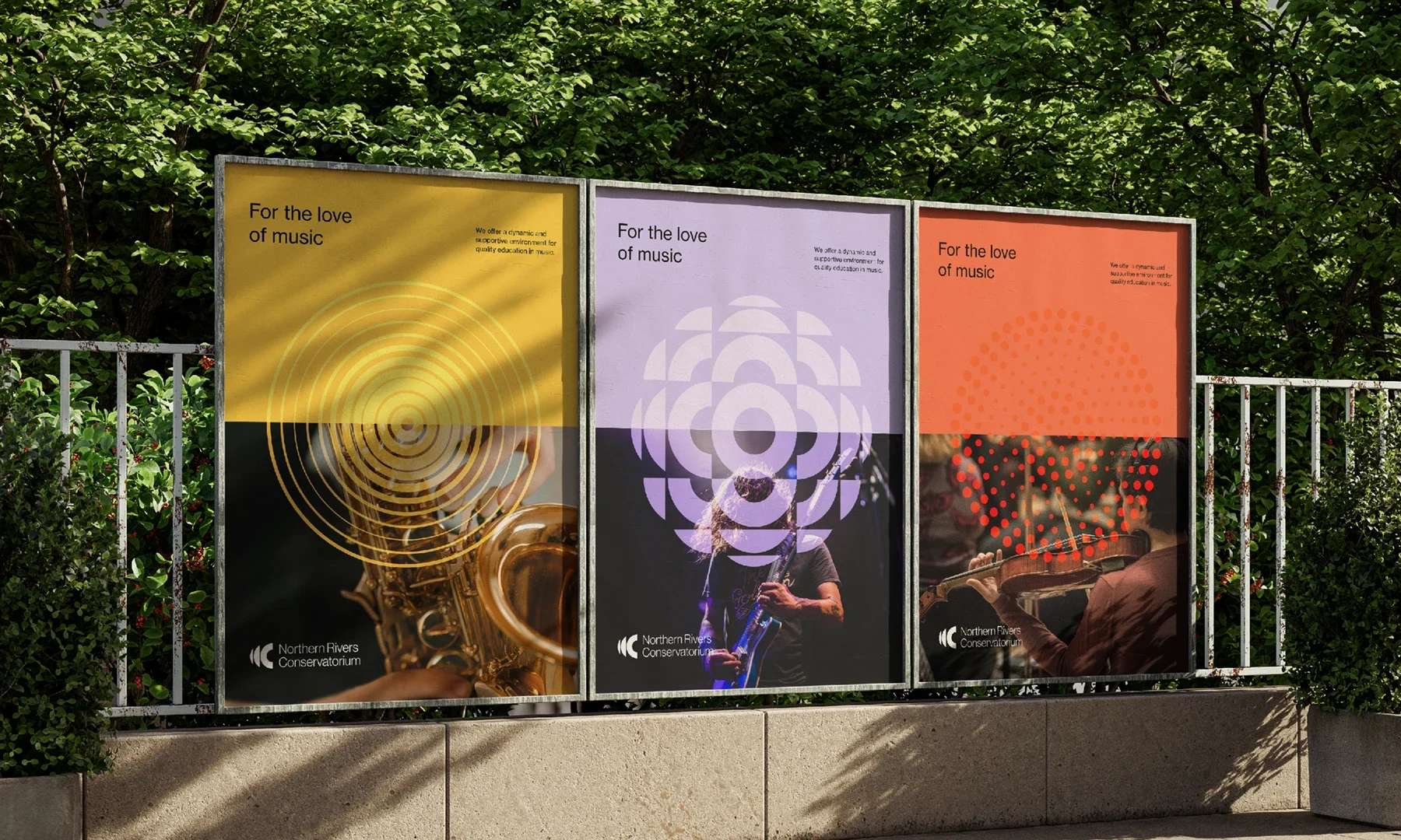
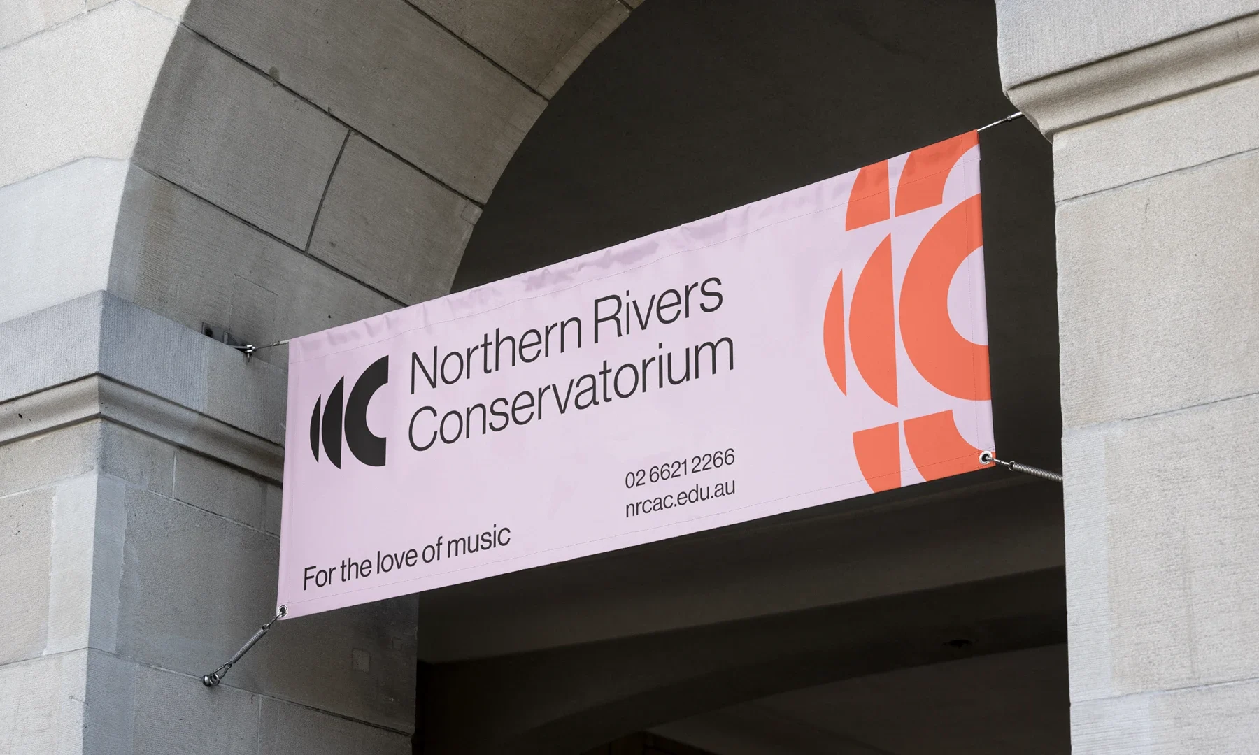
When the Northern Rivers Conservatorium asked us to help inspire a deeper connection with music, we responded with a bold brand refresh that honoured its enduring vision: For the love of music. Inspired by sound, movement, and light, the new identity features a confident logotype, dynamic circular icon, and a vibrant gradient palette drawn from the region’s celebrated “Rainbow” identity. Combined with modern typography, it creates a flexible and cohesive visual language that reflects the Conservatorium’s energy, creativity, and heart.
Brand Strategy | Creative Strategy & Direction | Video & Motion Design | Visual Identity
Executive Director, Northern Rivers Conservatorium
The refreshed NRC identity has been warmly embraced by the community with feedback being consistently positive from students, families, and colleagues – a true and authentic reflection of the organisation. There has been a significant uplift in enrolment since the launch of the new brand, supporting stronger enrolment trends for the year. NRC have also seen a growth in event attendance in step with the new identity, increasing the effectiveness of communications and driving enthusiasm for participation. Importantly, the identity has proven flexible and enduring, becoming a recognisable symbol of local pride that works seamlessly across both traditional and digital channels.